Author
Creative Analyst
Published
March 12th, 2026
Length
4 Minutes
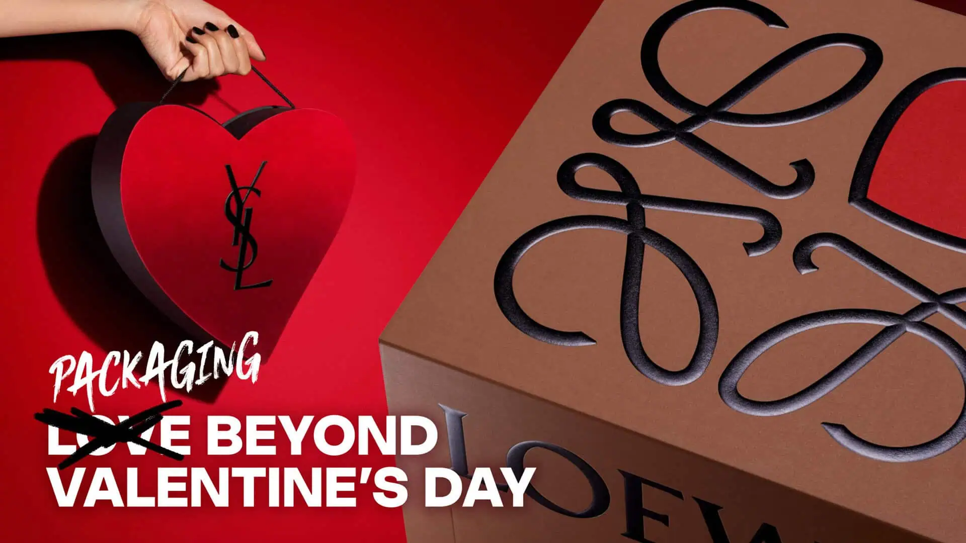
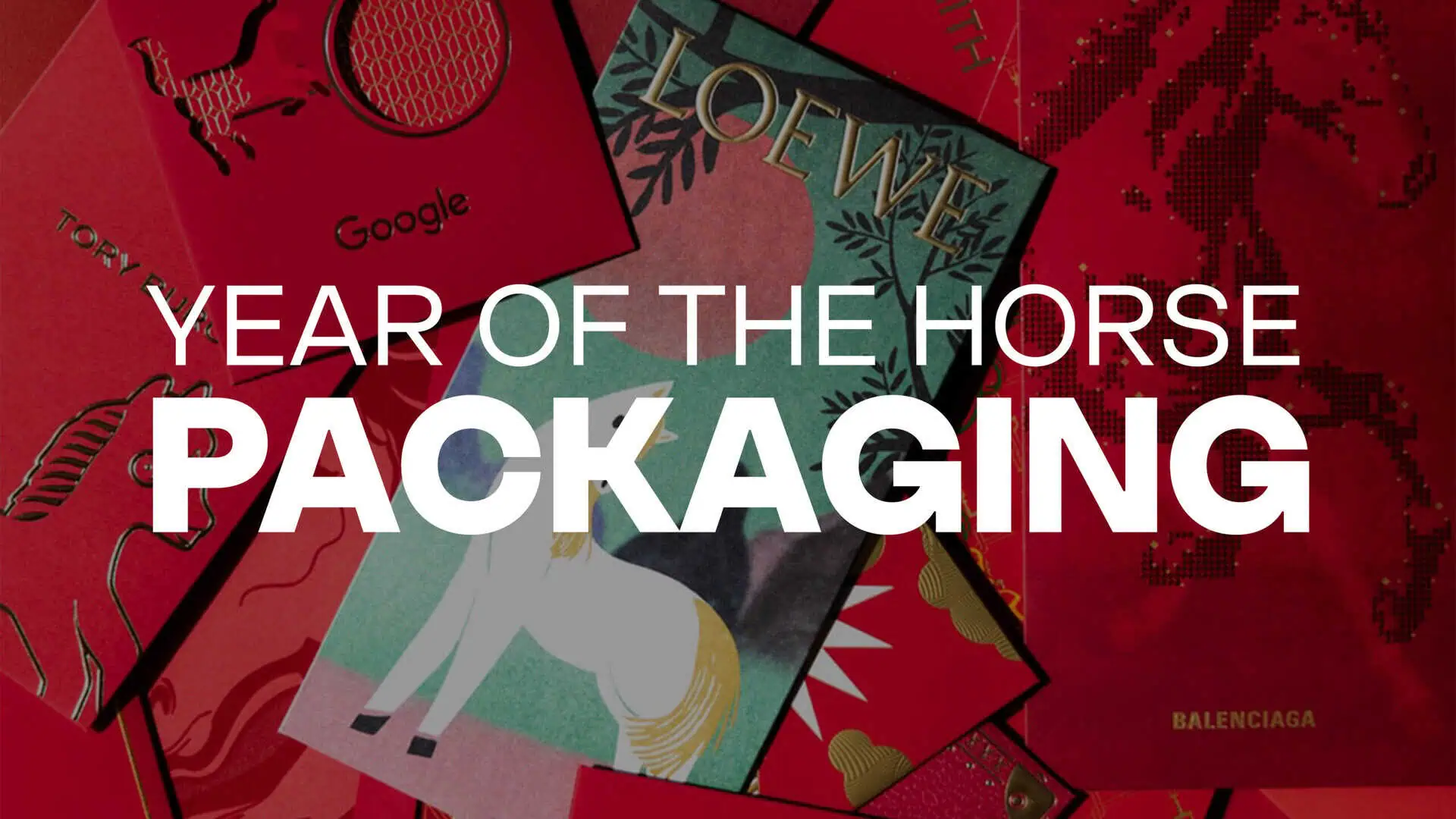
Lunar New Year packaging has become one of the most anticipated seasonal expressions across luxury and retail. From fashion and beauty to spirits and confectionery, brands reinterpret heritage symbolism through color, material, and structure.
While red and gold remain the traditional palette of celebration, the most compelling executions go beyond decoration. They translate ritual into packaging design, balancing cultural symbolism with precise production execution.
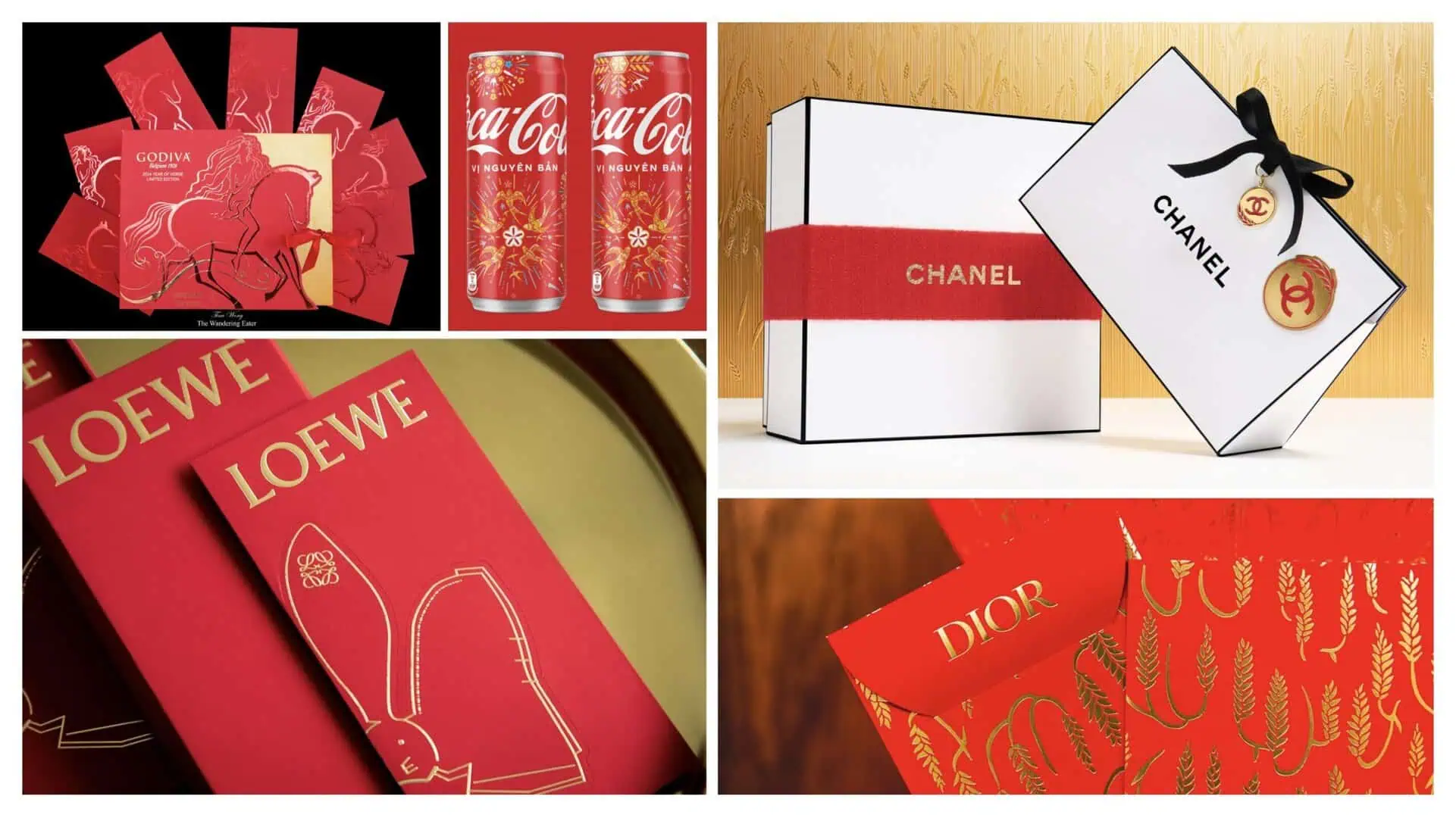
Tradition Through Material & Finish
Across the market, Lunar New Year packaging consistently leans into:
- High-impact red substrates
- Metallic gold foil stamping
- Embossed or debossed zodiac elements
- Intricate illustration layering
- Limited-edition detailing
From the bold celebratory cans of Coca-Cola to the refined foil-heavy executions of Dior and Loewe, the consistent thread is material elevation. Gold becomes dimension. Red becomes texture. Finishes create hierarchy.
The cultural codes are respected but translated through each brand’s visual language.
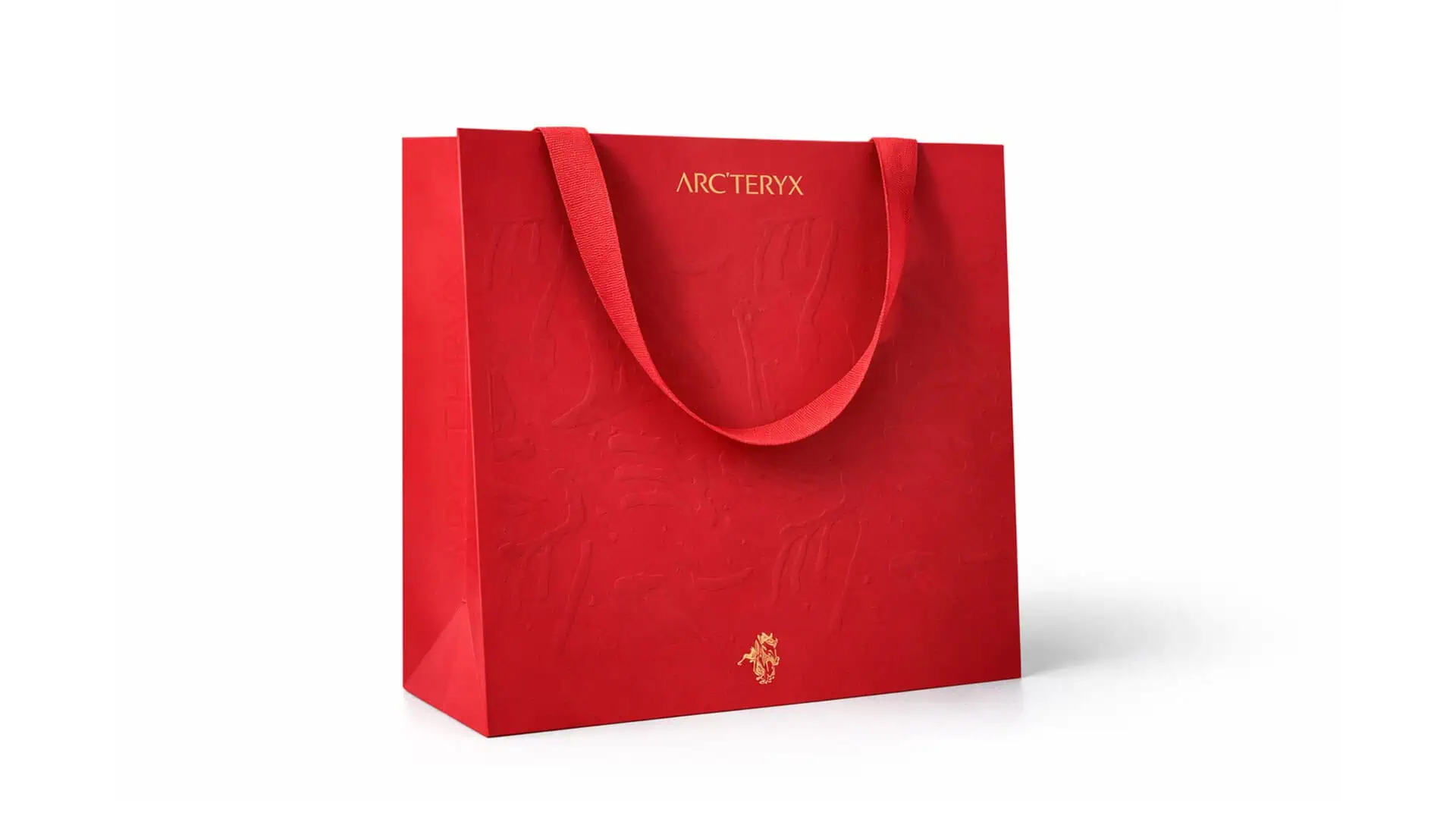
Texture and Restraint: Arc’teryx
The Arc’teryx Year of the Horse shopping bag takes a more restrained approach to Lunar New Year packaging. The design centers on a rich red substrate paired with gold foil embossed Arc’teryx branding and iconography. Rather than relying on printed graphics, the bag features a subtle fossil-inspired skeleton motif rendered through blind embossing across the surface, allowing the design to reveal itself through light and texture. This understated execution highlights material craftsmanship while maintaining the brand’s technical aesthetic, balancing Lunar New Year symbolism with Arc’teryx’s minimalist identity.
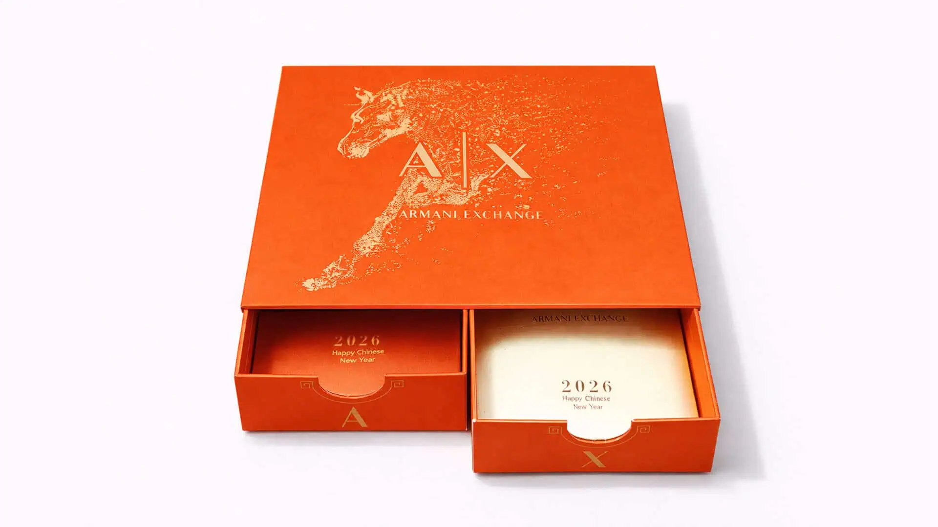
Structural Ritual Engineered: Armani Exchange
The Armani Exchange Year of the Horse envelope box, produced by IDP Direct, transforms the traditional red envelopes into a structured gifting experience. Its dual-envelope drawer system introduces a layered reveal, while the metallic red substrate and precisely applied gold foil elevate the celebratory tone. Armani‘s construction mirrors the ritual of gifting central to Lunar New Year, executed under strict production control to preserve detail and consistency.
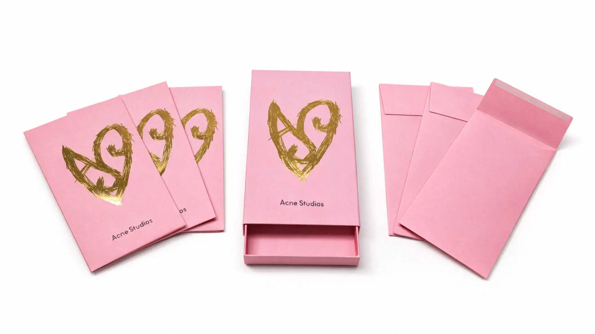
A Modern Take on the Red Envelope: Acne Studios
For Acne Studios’ Lunar New Year program, produced by IDP Direct, the traditional red envelope was reinterpreted through the brand’s minimalist design language. A soft pink palette replaces the expected red, paired with expressive gold brushstroke graphics that feel both modern and ceremonial. The structured drawer envelope format introduces subtle dimensionality while maintaining the simplicity associated with gifting. The result is a refined interpretation of Lunar New Year packaging that feels contemporary while still rooted in tradition.
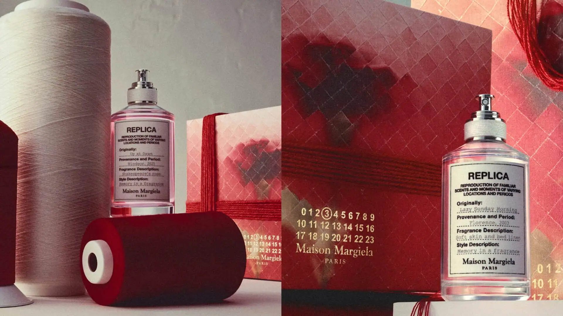
Subtle Seasonal Interpretation: Maison Margiela Replica
Maison Margiela approaches Lunar New Year with restraint, translating the celebration through texture and material rather than overt symbolism. The Replica fragrance gift set introduces layered red tones and thread-wrapped details that echo the ritual of gifting while preserving the brand’s minimalist aesthetic. The packaging remains consistent with Margiela’s archival design language, allowing the seasonal palette to feel integrated rather than decorative.
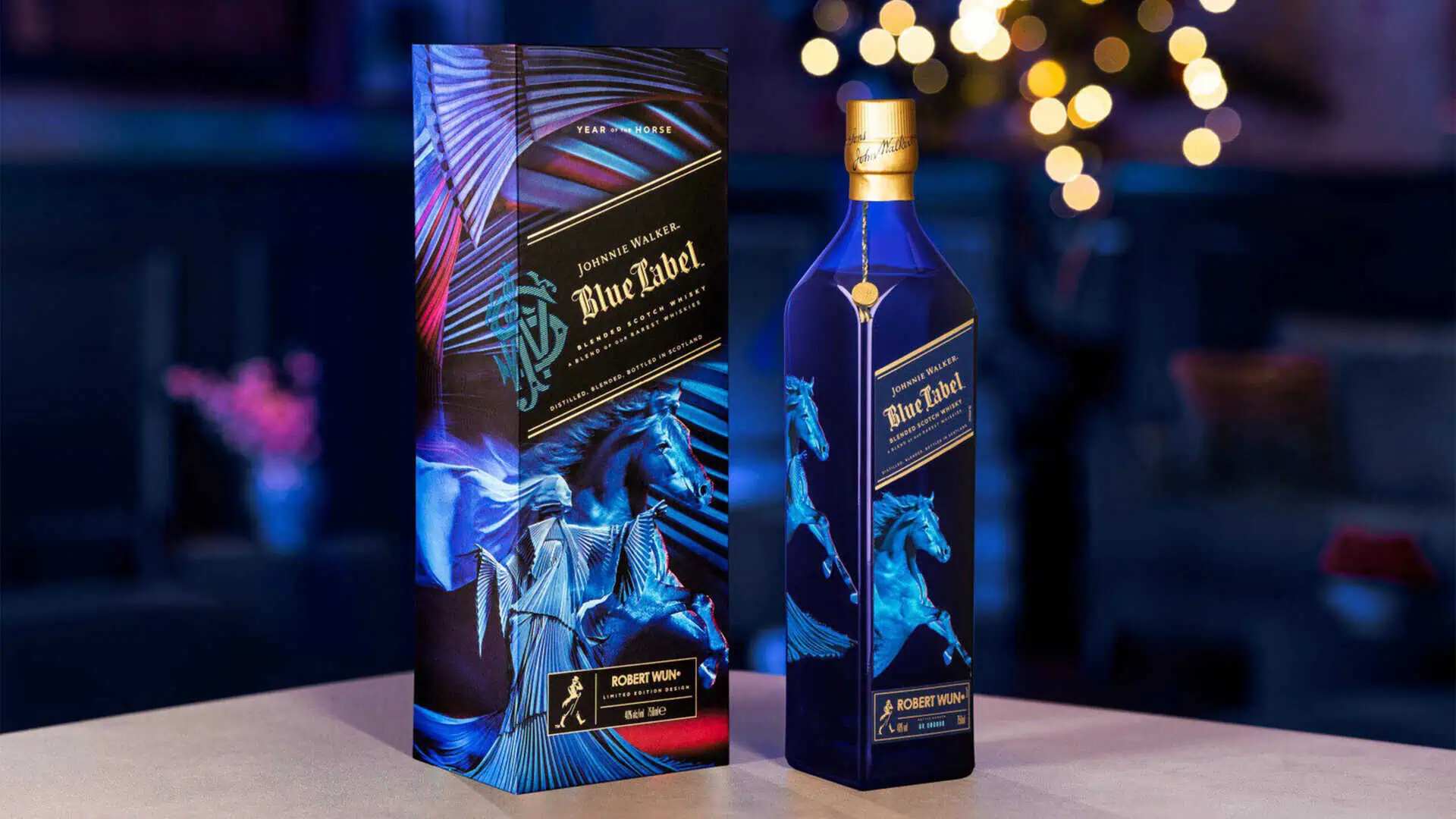
Breaking the Red Mold: Johnnie Walker
While red and gold dominate Lunar New Year packaging, some brands choose to reinterpret the palette entirely. Johnnie Walker’s Year of the Horse limited edition, designed in collaboration with fashion designer Robert Wun, introduces a striking blue color scheme with metallic accents and dynamic horse illustrations. By stepping outside the expected color language while maintaining zodiac symbolism, the design demonstrates how Lunar New Year packaging can evolve while still honoring tradition.
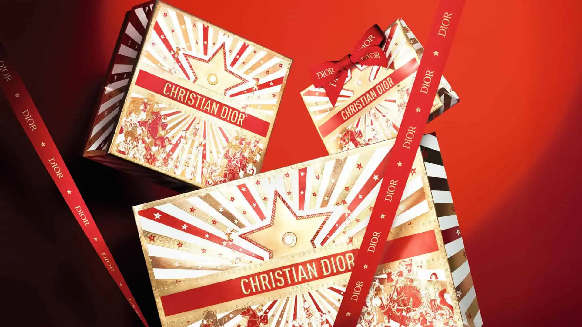
Ornamentation and Celebration: Christian Dior
Christian Dior’s Lunar New Year packaging leans into spectacle through richly layered illustration and radiant gold finishes. Festive motifs, starbursts, and ornamental graphics spread across rigid gift boxes, creating a sense of movement and celebration. A bold red ribbon with gold branding anchors the composition, reinforcing Dior’s recognizable luxury signature. The result is theatrical yet precise, balancing exuberance with craftsmanship.
Conclusion
Lunar New Year packaging remains one of the most technically demanding seasonal programs for global brands. It requires balancing cultural symbolism, limited-edition storytelling, and large-scale production precision.
Whether through intricate foil work, structural innovation, or modern reinterpretations of traditional motifs, the most successful executions transform seasonal packaging into collectible brand moments.
When design vision and production expertise align, Lunar New Year packaging becomes more than celebration, it becomes engineered storytelling.
If your brand is exploring Lunar New Year packaging for upcoming cycles, early collaboration between design and production is critical. Let’s talk.