Author
Rania Elqadah, Packaging Designer
Published
December 4th, 2025
Length
3 Minutes
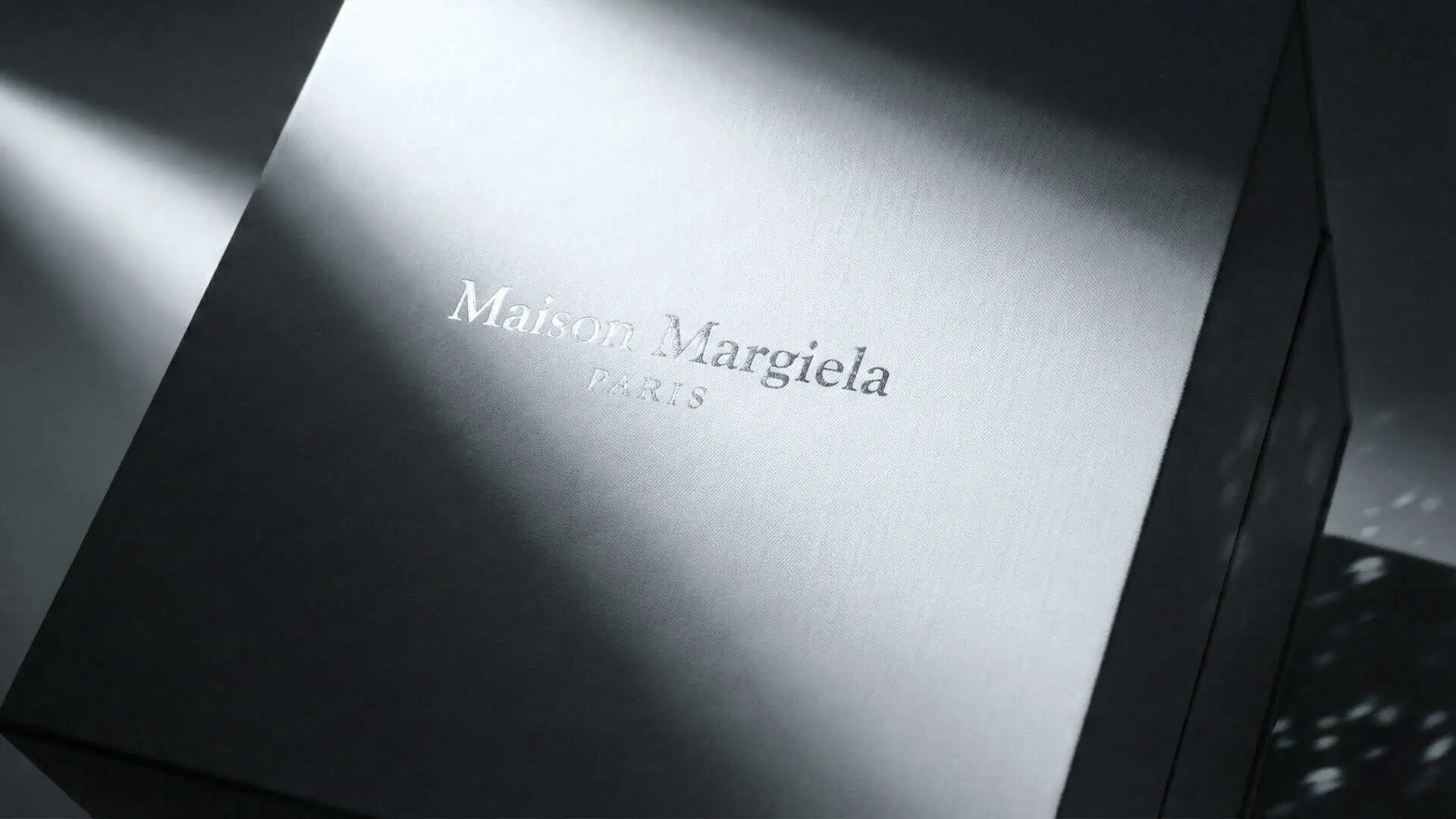
Maison Margiela Packaging Design proves that some creations live beyond trend, they become symbols of identity, artistry, and intention. For over three decades, Margiela’s Tabi has been one of those quiet icons: instantly recognizable, endlessly reinterpreted, and always divisive. Its split-toe silhouette defies convention, standing as a statement of both individuality and anonymity.
When we were asked to design the Maison Margiela Tabi Collector Box, our goal was simple, to translate that same feeling into packaging. A box that didn’t just hold the boots, but belonged to their world. Minimal, conceptual, and meticulously crafted, the box became a study in Margiela’s duality: between form and absence, function and feeling.
The Concept: A Split for the Tabi Soul
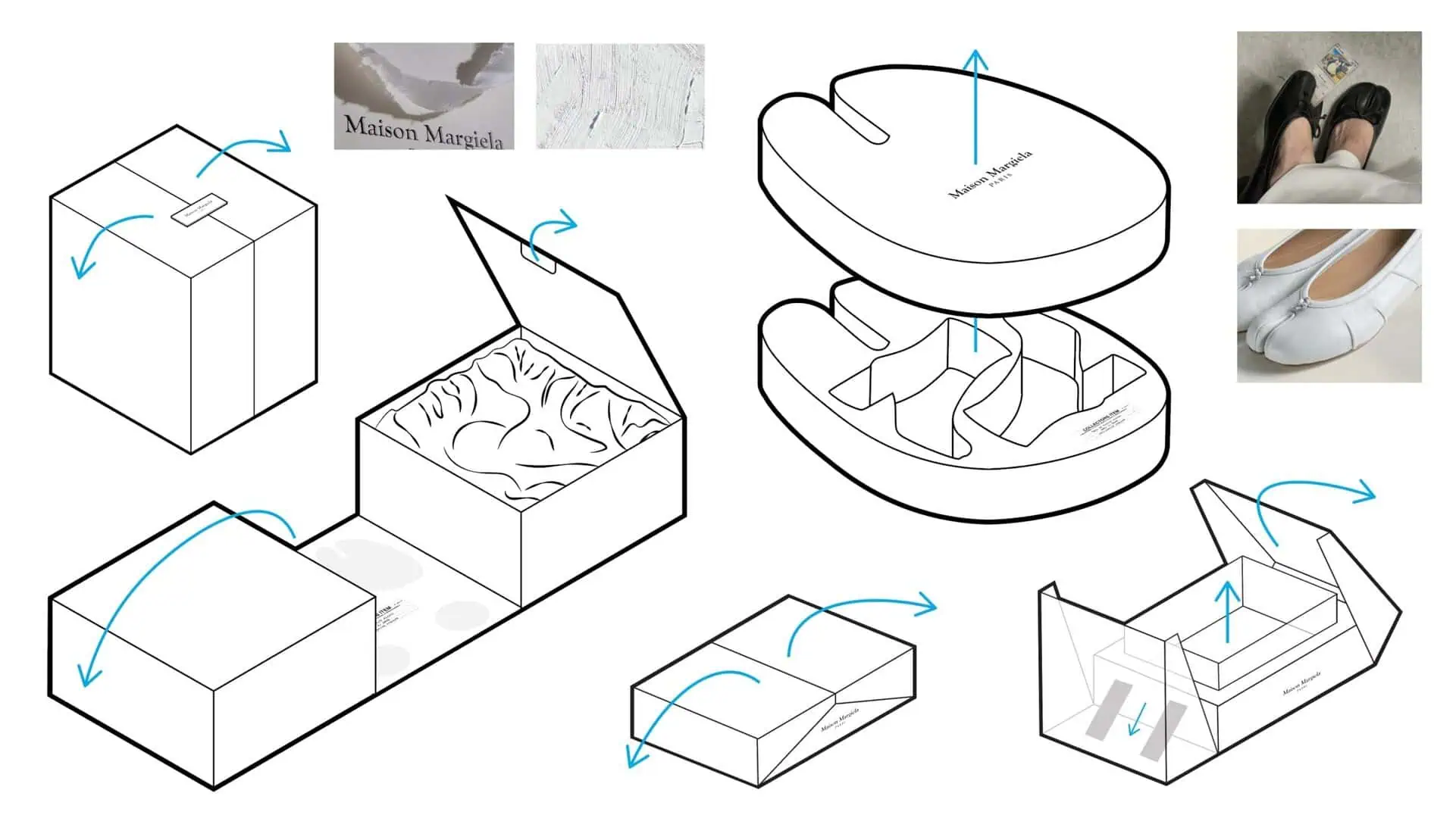
Every Maison Margiela packaging design begins with a disruption, a quiet rebellion dressed in precision. The Tabi Collector Box follows the same philosophy. Inspired by the house’s most enigmatic symbol, the split-toe Tabi boot, our packaging interpretation began with that same line, a single, deliberate split.
The split concept became the centerpiece, a literal division that mirrored the Tabi silhouette, creating symmetry through asymmetry.
The Process: From Sketch to Collector’s Box
As both a packaging designer and Margiela fan, our approach to this project was like a study in restraint. The process unfolded in stages: moodboards of Margiela archives, muted palettes, and tactile swatches of wrapped fabric and coated boards.
Early sketches explored Tabi inspired shapes and themes. The goal was a movement that felt instinctive and ceremonial as though unveiling the box was part of the Tabi ritual itself.
Every dimension, every reveal, was designed to slow the unboxing, to let the product resonate.
The Details: Footprints, Fabric, and Form
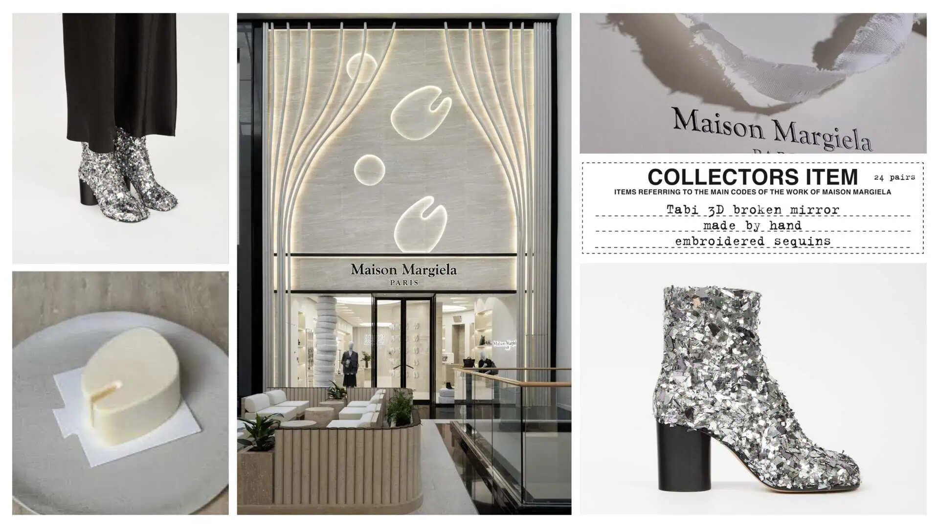
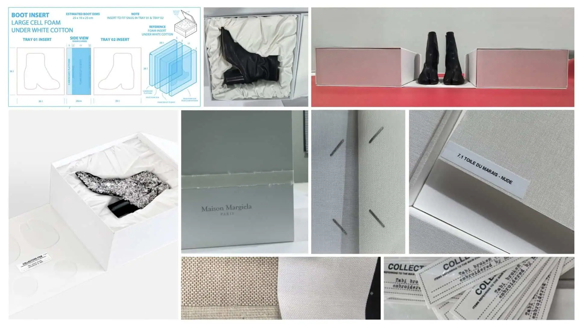
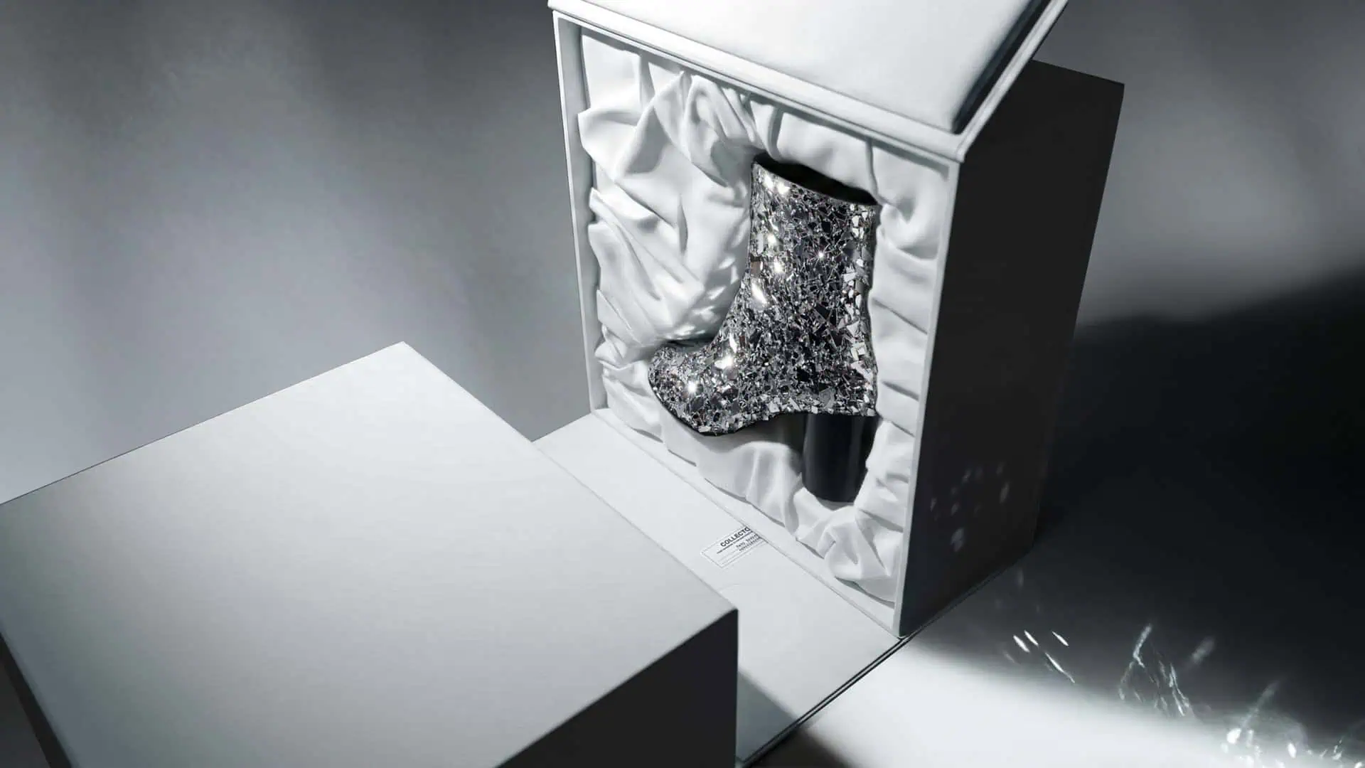
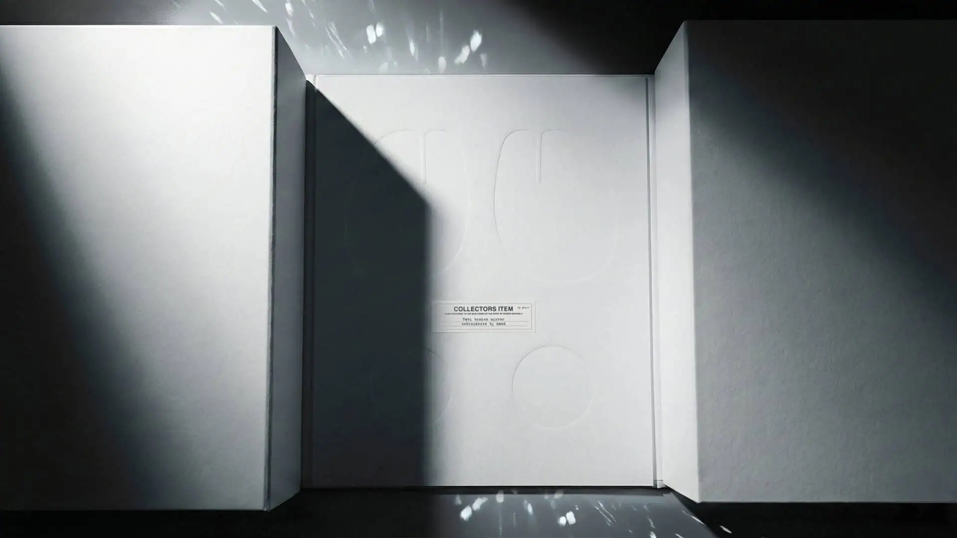
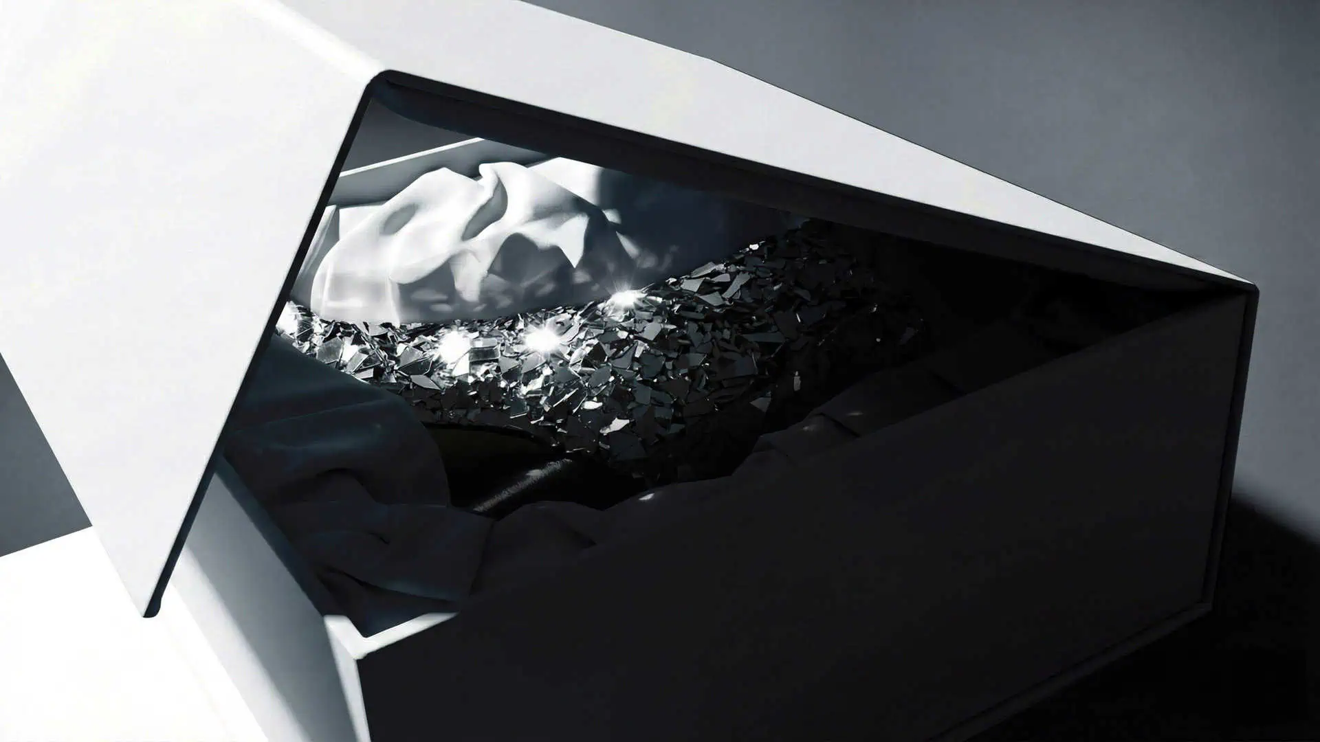
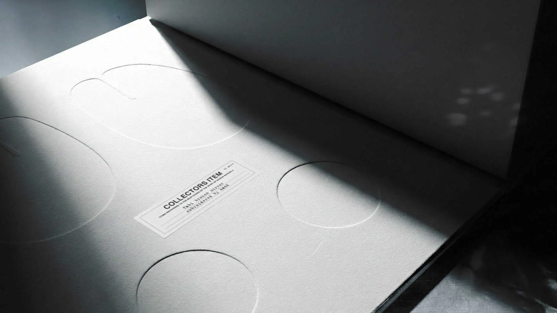
Inside, the Maison Margiela Tabi Collector Box reveals its secret. Beneath each boot lies the imprint of the Tabi sole, debossed footprints pressed deep into the base, a quiet nod to Margiela’s fascination with trace and identity.
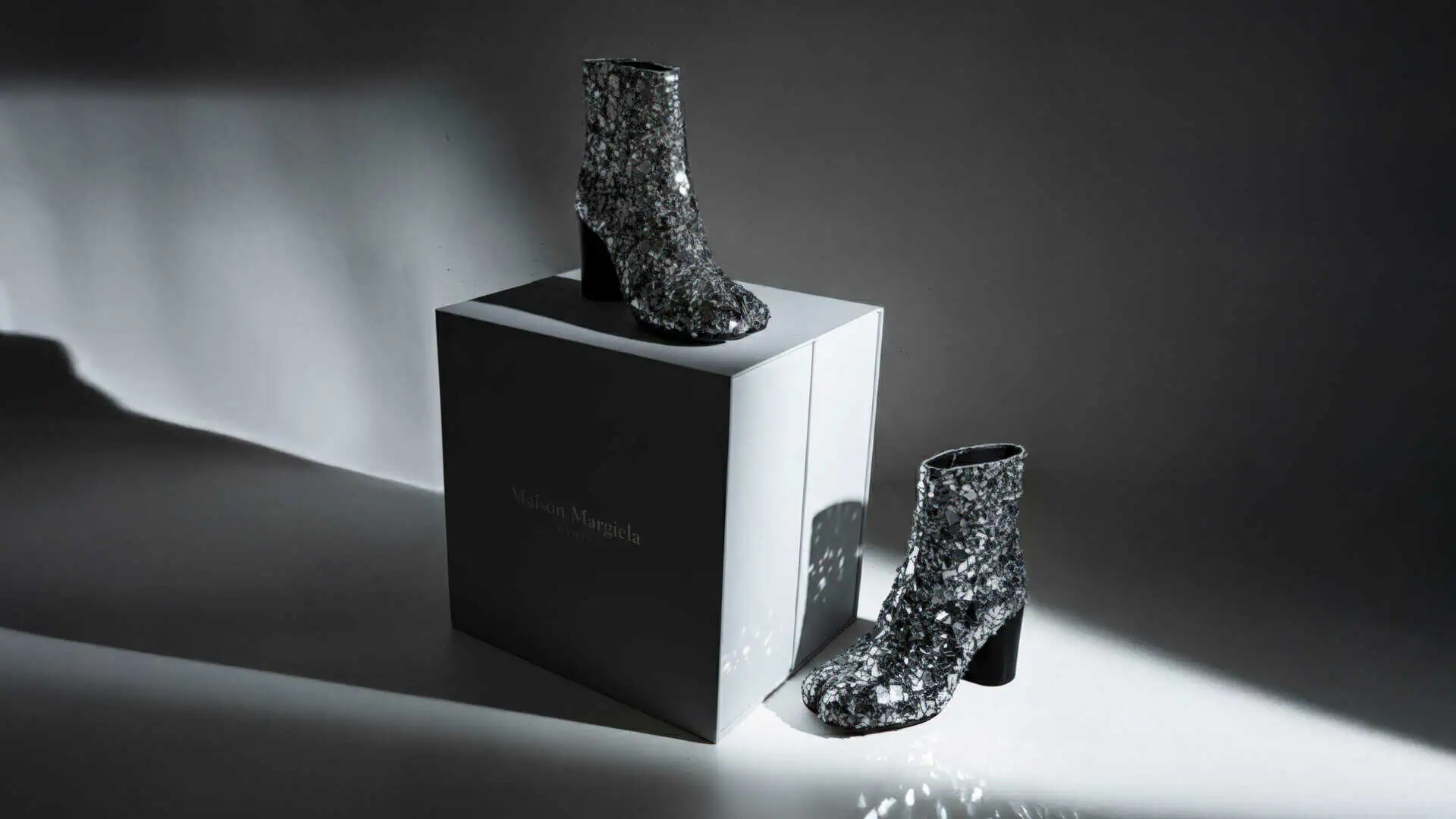
The padded diecut insert itself is fabric-wrapped, soft to the touch, evoking the intimacy of couture. The magnetic elements mirror the divide of the Tabi toe, each side distinct, yet bound together by symmetry. The exterior carries a matte white finish with a tactile grain, minimal silver foil branding, and that unmistakable split seam slicing through the structure. A Margiela signature without the need for words.
The Result: Packaging as Art
What emerged was not just packaging but an object of collection, a box that mirrors the philosophy of the brand it protects. This Maison Margiela packaging design invites pause. It challenges the idea of packaging as disposable, reframing it as a vessel of memory and meaning. Each detail; the split, the Tabi footprints, the collector’s label, transforms a shoebox into a shrine for design devotees.
What Brands Can Expect from IDP
At IDP Direct, we approach packaging as architecture, where every line serves a purpose and every surface tells a story. From sketches and swatches to final production, our process is deeply collaborative. For brands like Maison Margiela, Chloé, and Jacquemus, this means a trusted partner who understands both artistry and engineering. Where concept and construction evolve hand in hand.
When your packaging becomes an extension of your identity, you move beyond boxes.
You create icons.
Let’s create your next icon together.