Author
Packaging Designer
Published
October 7th, 2022
Length
2 Minutes
What does it mean when we see that Pantone released their Spring/Summer color trends?
These are colors either created for or existing that may represent the coming trend. The brief to select these colors may include offsetting the current political mood, what’s happening in retail, or the general feeling across the planet. The color trends brief and process is not widely known as the colors are selected in secret with a small group of hand-picked designers. Regardless of the how, the fact is that it’s here and we’re going to see these colors in articles for the next few months.
Here’s how to incorporate colors into your packaging, as well as what not to do:
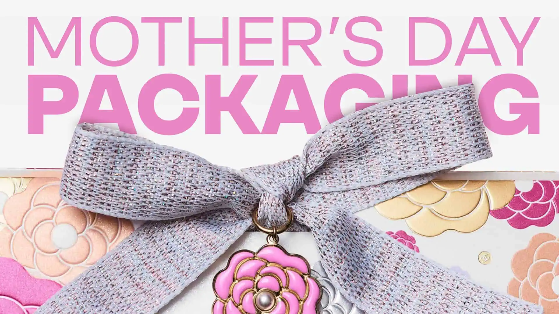
1) Seasonal or Limited Edition Packaging Accessories.
Adding a colored ribbon closure to your evergreen packaging for Valentines, Christmas, or Mother’s Day are easy ways to incorporate these colors into your packaging. Please don’t change your packaging colors to try to keep up with trends, they’ll change in a few months.
2) Accent Your Packaging Photography.
Many brands share stylized photographs of their packaging on their sites showing gifting options, or marketing sustainability changes in packaging. Use a filter or colored lighting to highlight your packaging. Once again, it’s not time to change the color of your packaging, just connecting with the trend.
3) Don’t download Pantone connect. Yet.
In order to use these colors in your upcoming designs you’ll be told that you need to download the Pantone App as Pantone is no longer widely available in Adobe software. The app does not work and it makes your workflow a little more complicated. Learn how to use these colors without using the app or changing your workflow, watch this video from Creative Director, Evelio Mattos.
What’s your favorite color of the Spring/Summer Pantone color trends?
We’re partial to Tangelo.

Obviously.