Walpole
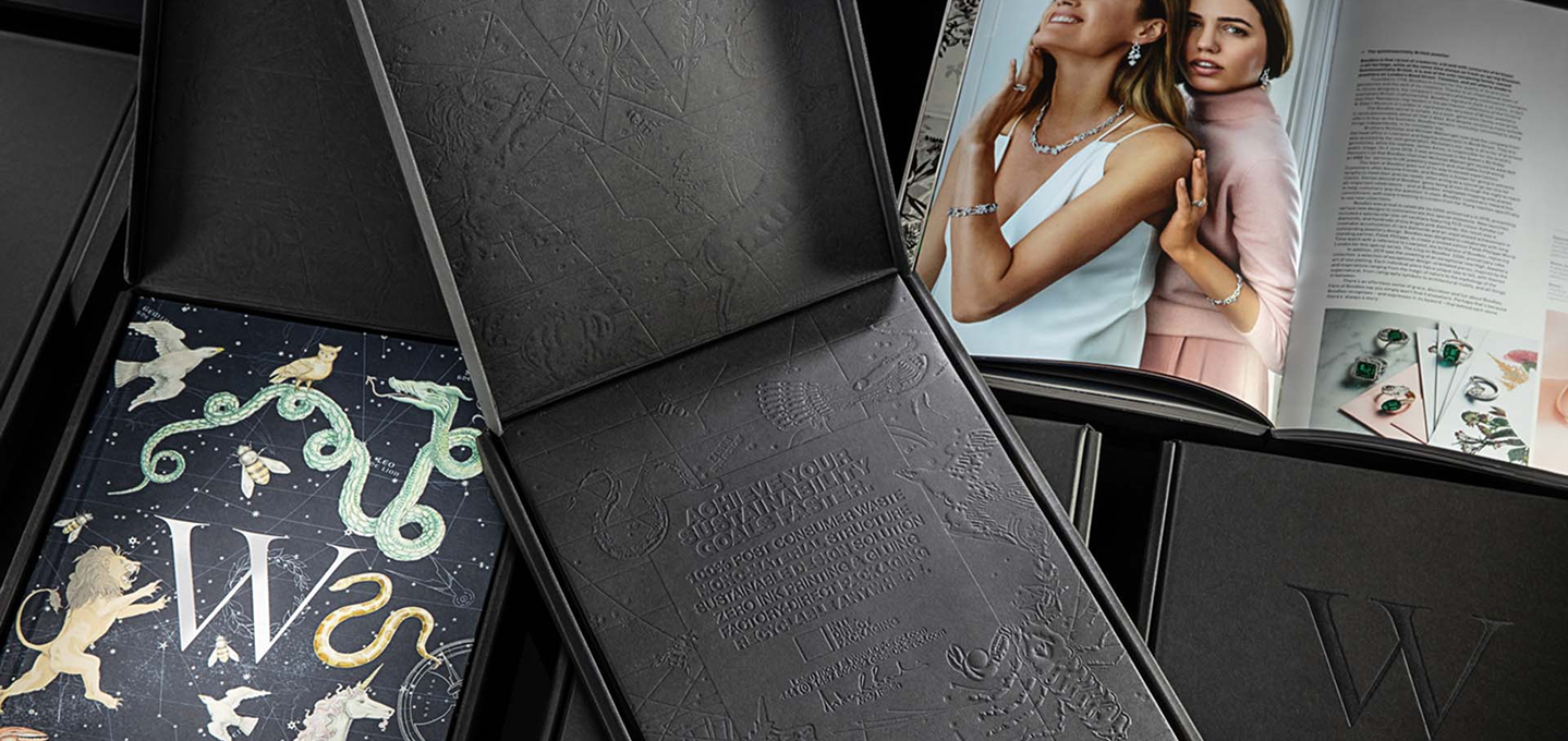
Luxury without ink. Walpole challenged IDP Direct to create an e-commerce package worthy of British luxury while eliminating processes that weren't necessary. The result used recycled paper made in part from recovered coffee cups, no printing inks and no adhesives, relying instead on structure, paper and multi-level embossing to create the experience.
Project Overview
Created to deliver Walpole's annual yearbook, the e-commerce shipper had to protect the publication while making the unboxing feel considered enough for an organization representing more than 270 British luxury brands.
IDP engineered the structure and translated the yearbook's detailed artwork into multiple levels of embossing and debossing. Rather than printing the artwork, light, shadow and texture create the graphics directly in the paper.
Design for Absence
Luxury packaging often adds more to create value: more print, more finishes, more materials. For Walpole, we went the other direction. The artwork was interpreted through multiple levels of embossing and debossing, allowing light, shadow and the surface of the paper itself to create the graphics. The structure was engineered to assemble without adhesive while protecting the yearbook through e-commerce delivery.
Recycled Coffee Cup Board
The paper was made using recovered fiber from post-consumer coffee cups, giving a difficult-to-recycle waste stream another use. Five layers of paper were combined into corrugated board to create the strength required for e-commerce delivery while providing the dense, tactile surface needed for detailed embossing.
No Ink. No Glue.
Rather than replacing conventional ink and adhesive with “better” versions, we questioned whether the package needed them at all.
It didn't.
The graphics are created through embossing and debossing, while the structure folds and locks together mechanically. Two processes normally expected in a premium e-commerce package were engineered out entirely.
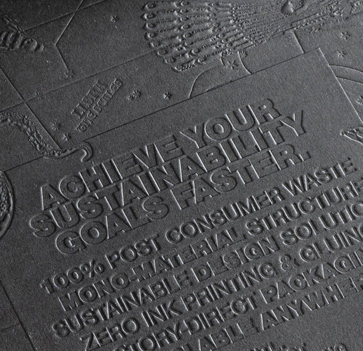
Multi-Level Embossing
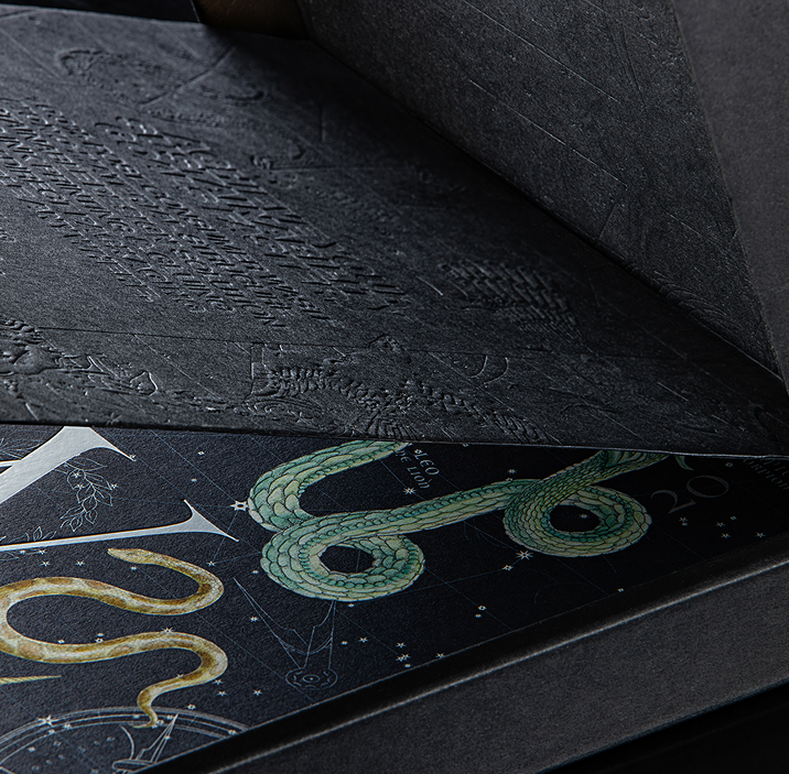
Without ink, the surface had to become the artwork.
IDP translated the yearbook's detailed illustrations, typography and graphic elements into multiple embossing depths. Some details rise from the surface while others are pressed into it, creating contrast through nothing more than paper, pressure, light and shadow.
Structure Does More
Removing glue meant the engineering had to work harder.
An internal folding panel reinforces the shipper, protects the edges of the yearbook and holds the publication securely in place. The structure was engineered to accommodate both hardcover and softcover editions while creating a deliberate reveal when the package is opened.
No added insert. No adhesive. The structure performs the function.
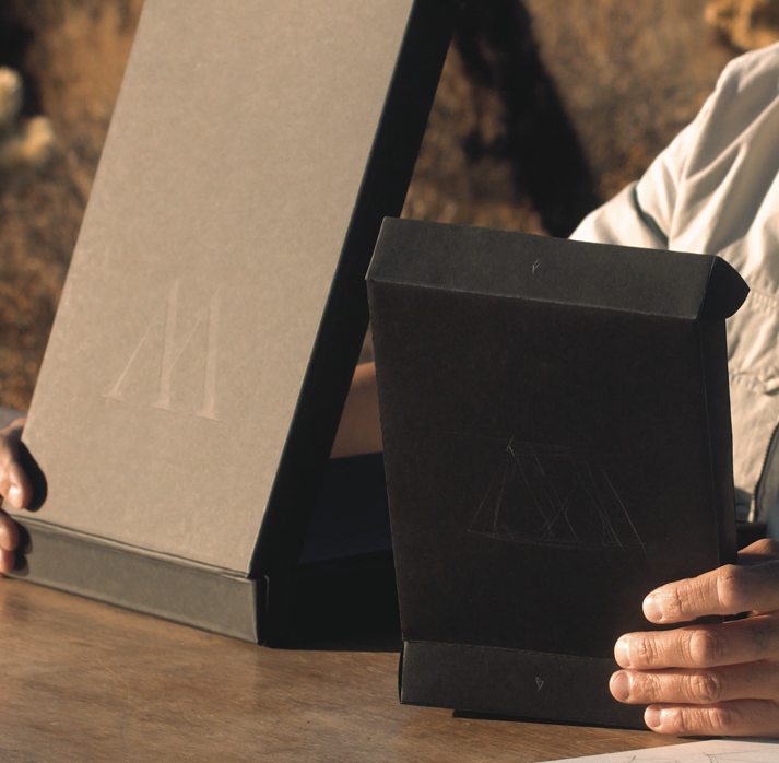

Less Added. More Experienced.
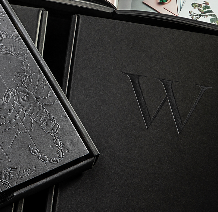
The restrained black exterior deliberately holds back. Texture replaces print. Structure replaces glue. The yearbook remains the most colorful element of the experience, revealed only when the package is opened.
The result is that the absence of decoration becomes part of the design.
WHAT DESIGN FOR ABSENCE MEANS TO WALPOLE
The first question shouldn’t be which ink or adhesive to use. It should be whether you need them at all.
Certified at Every Level
Independent certifications verify the materials, manufacturing systems, environmental management, and ethical standards behind production across IDP Direct's global factories.
Verified by SCS Global Services

Verified by SCS Global Services

Corporate sustainable rating
Environmental management systems

Ethical trade and responsible sourcing
See More of Our Work

How we turned a redesign into a global program. Testing concepts and materials before scaling across packaging.
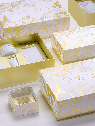
How we reengineered a holiday gift set. Complex foil details with flat-packed paper inserts designed for premium skincare packaging.
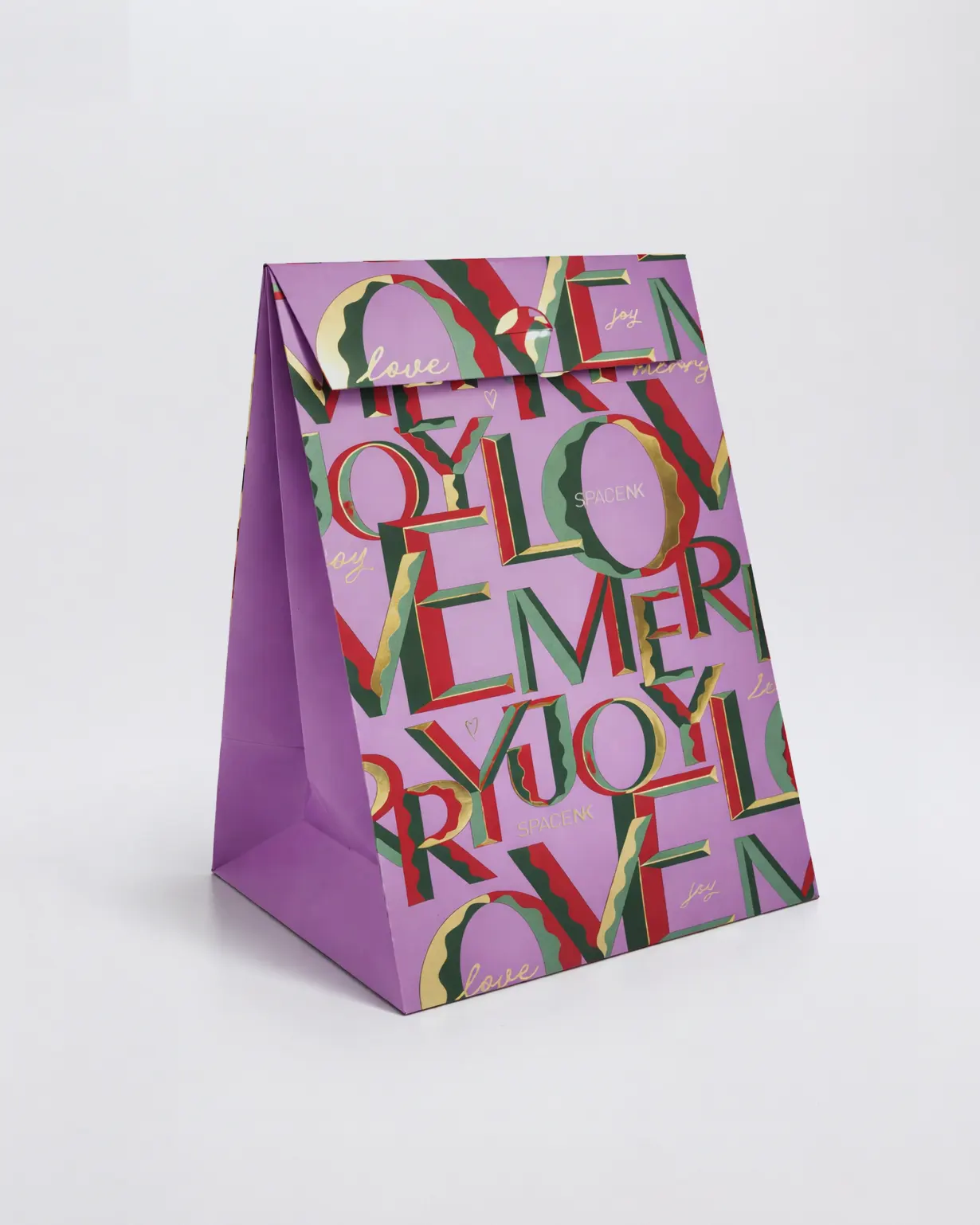
How we made the bag work harder.
More capacity with less material, refined for each holiday program.
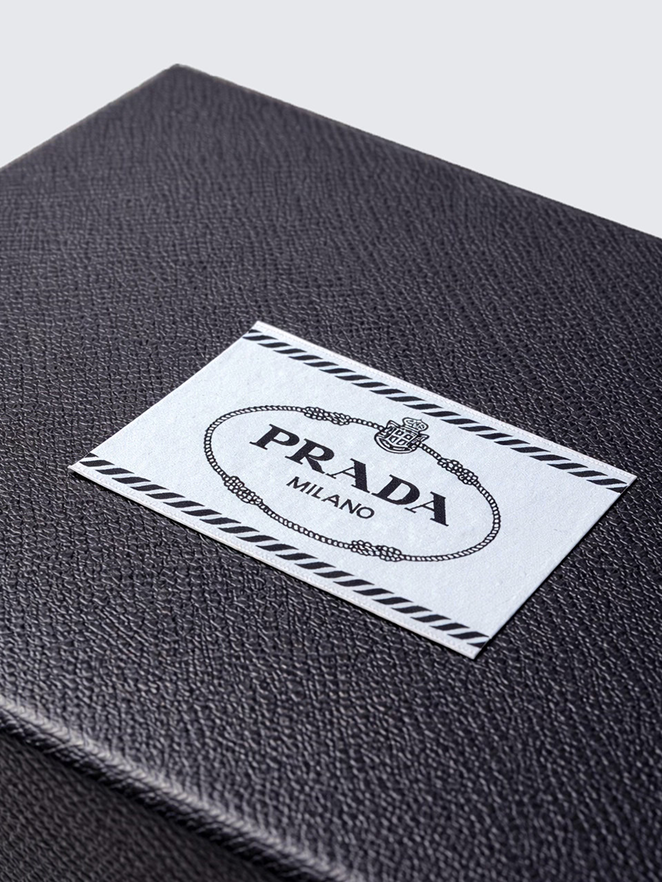
How we engineered brand consistency. Custom-made paper creates one color and texture across bags and collapsible boxes.